Friday 18 February 2011

Contents

Stage 1: Investigating past ancurrent practice in capture

Stage 2: Planning your capture


Stage 3: Exploring and experimenting


Evaluation

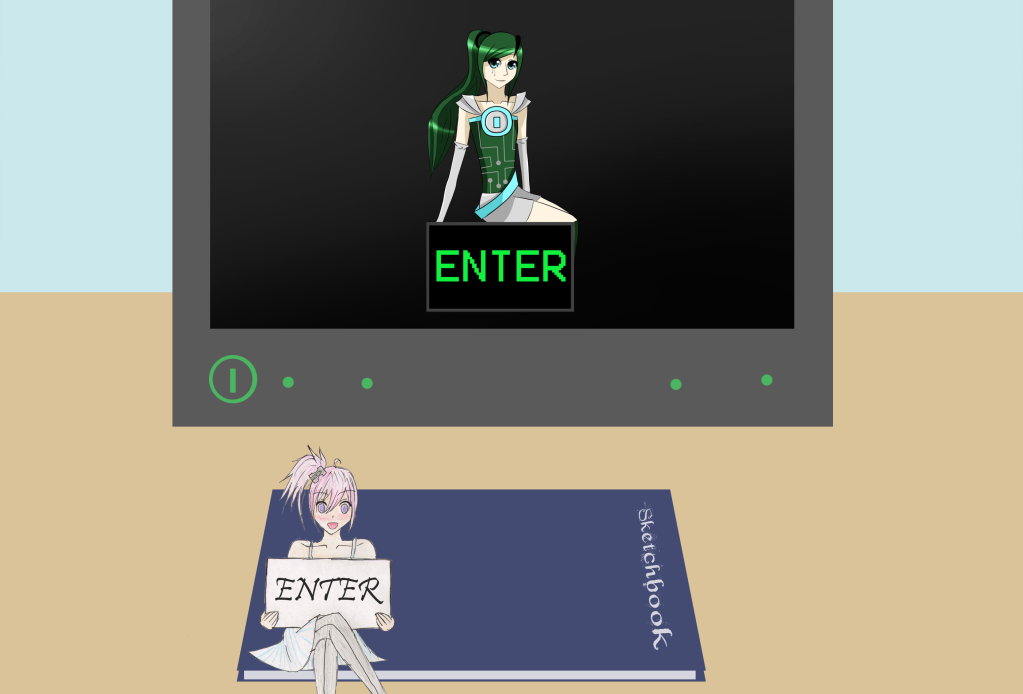
For my capture project I made a website called Manga Sketch, a website dedicated to manga/anime style art and tutorials for it. First I looked at existing websites that provide what I wanted my website to provide. The two main websites I looked at were DevianART and Manga Tutorials, they gave me lots of idea’s oh how to effectively make the kind of website I was making. I them moved on to making a plan in photoshop and then the base’s for the pages. I then started on my mascots, one on paper and one in a program in paint tool sai with the use of my drawing tablet. I then animated these in flash on the enter page. Finally to complete my project I made all the links and scrollbars in flash.

I think the effects on my buttons and my artwork worked best in my website, especially the ones on the enter page. I think that it just made the website less boring and gave my website a better visual look in general. It also helped you get the feel of the website as well as giving the site some individuality.

In future projects I will use all the information I have learned from making this website, especially about buttons and layers and the scroll bar. I will defiantly be using the scroll bar again as I think it’s a really effective tool and helps with keeping the page clutter-free. I also will use my knowledge of layers again as it just makes the whole process easier, especially with the ability to lock layers your working on so you don’t select things you shouldn’t. As for buttons, I think I will defiantly use them again, especially with the different things you can change on ‘up’ ‘over’ ‘down’ and ‘hit’.

My research really helped me work out what looks good and what looks bad on a website, it helped me change some of my plans like how I was going to have music on the site but I know now that most people find this really annoying and that if there isn’t a visible mute sign they may even leave your web page.  My other research wasn’t really that helpful though.

If I had to do this again I would have more images of the mascots and I’d try making the background images for the traditional and digital pages more interesting, for example doodles on the traditional background and more shine and shadows on he digital background to make it look more modern.

All in all I’m proud of my website even if it could do with a bit more work. I have also learnt a lot about how to work flash and photoshop through this project, hopefully the techniques I have learnt will stay with me and make me a better website designer and improve my skills in general. 

Designs for my web page and final website

To make my webpage's I used photoshop and flash for links. For the traditional pages I was going to use this scan of lined paper but it wasn't clean enough so I used it as a template for my final version where the lines were made by the rectangle select tool. I also used the rectangle select tool to make my digital page.


This is an example of one of the finished web pages.


Final website: http://swfcabin.com/open/1300276599

Enter page

I wanted to make a flash enter page for my website from the beginning and I decided I would take a picture of a computer screen with a sketch book in front of it and then put in my mascots. I took the picture with my Camera, a Canon PowerShot A490, in college. The lighting was not good and I had to get rid of the background and some of shine of the screen as well as lower the saturation.
After a while I realised that this wasn't working, it looked out of place and weird so I made a new background in photoshop. I think this looks a lot better as the mascots don't look out of place.

My website plan and logo


This is my plan for my website I'm making. The logo you see here is a rough idea of what I wanted, at first I just wanted to have the symbol of an eye with M and S in it but I then decided this wasn't such a good idea as the name of my company wasn't that well known. Therefore I decided to just use the website name, like how I did when I was still designing for Pandorable. 
This is my final logo design.

Tuesday 8 February 2011

3D experimentation

Today we experimented in 3D with photoshop again. First we made a black to white gradient on the background and used the text tool to type our name. We then went into 3d Repousse and then text layer. We then played around with extrude and lights as well as paning and zooming just like 3D max.
I liked doing this but I still prefer 3D max as its fully focused on 3D and in photoshop 3D is just an extra.

Tuesday 1 February 2011

3D Experimentation


These images were made in photoshop by duplicating the layer so you have two, we then named one red and one blue. We then went into image > adjustments > curves and on the blue layer we went into red and changed the values into 0 and 251. For the red layer we went into green and changed the values to 0 and 251 and then into blue and changed the values to 0 and 251. We then set the layer option for the top layer to screen and move it slightly. This gives the image the illusion of being 3D when wearing retro 3D glasses, this works best on the image of the pig as it was a photo of something 3D to begin with, the piano keys work well as well but there isn't much detail in them.