Tuesday, 14 December 2010

Making a website

For my website design  I came up with this idea in photshop which was developed from my design for the iPhone. I decided to add a scrolling panel across the top under the logo witch will take to whatever product you clicked on. The glow effect was made by duplicating the layers, adjusting the brightness and blurring them. I also intended the links to be on the left hand side.

After looking at a load of good and bad websites I realised that links are almost always found on the left of a website so I decided that this wasn't such a good idea. I then tried to make the website in flash but I couldn't get all the effects I wanted so I went into the photoshop file and played around with the layout so its more central so I could import it into flash.
In flash I added four buttons below the logo and set up for different pages. I quite like the layout I used and the scroll works nicely.

Wednesday, 8 December 2010

Neville Brody

Neville Brody is a graphic designer, typographer and art director, he's worked for different magazines and made cd covers. His work mostly focus's around typography and pushed the boundary's of art at the time, therefore he was looked down upon by his tutors. His work became more popular and accepted around the 80's and he's been popular ever since.

Personally I'm not very impressed with his work as although when he started it what he was doing was fresh and new now it's everywhere and although it can be creative and limit breaking its still just pictures and words, which I don't find very interesting to look at although I appreciate his hard work.

I don't think I'll use any of Brody's idea's in my website as it doesn't really fit with the image of the website.


Info from:

Tuesday, 7 December 2010

Making a website in flash

Today we made a simple website in flash using pre-made buttons. First we made four layers; background, content, buttons and actions, we then added a new keyframe every 10 frames up to frame 30, we then went to frame 40 and added a new frame. We then got rid of all the keyframe's on the button layer and made a new frame on layer 40 so that things on the button layer will stay on the stage the whole time. We then made a coloured rectangle on the background layer and changed the colour for each page. We then made each button link up to a page buy using the command go to and stop. We also put a stop on the first frame. We learnt how to make a scroll bar by changing the text option to dynamic text typing what we wanted and going into components and dragging the scroll bar to the text box.
This was considerably easier than dreamweaver and I will use flash to make my website. I will also be using a scroll bar.

Wednesday, 1 December 2010

More flash experimentation

Today we made the image of a seagull flying in flash. First we made one of the assets into a movie clip and went into it to add the rest of the assets (left wing down/up, right wing down/up and the body) on a layer each and had the wings up for 4 frames and down for another 4. We then went out of the movie clip and positioned the seagull at the left of the screen, we then moved it to the right side on a new keyframe on frame forty. We then tweened them and repeated the process but flipped the seagull around.
I enjoyed doing this as I am interested in animation anyway so this was an useful exercise. If i could do it again though I'd add more frames so that it moves more smoothly. 

Animating my logo

Today we tried to make an animation in photoshop of our logo. I decided at first to have the crown fade in and then have PANDORABLE revealed by tweening a black block from over the text to the left of the text, this looked horrible though so I blurred the block. Unfortunately this still looked rubbish so I started to fade in every letter one by one, at first I had 5 frames added for the tween but this made it too slow so I changed it to 1.

I then decided I wanted the crown to change colours so I duplicated the crown layer and changed it to a dark pink, then for each frame I raised the opacity on each frame. 

I then added a fade out of the word and the colour of the crown.


Tuesday, 30 November 2010

Website designs

Today I looked through a variety of different websites to look at what makes a good website and what makes a bad website.


Examples of good websites could be found on a design website called 99designs, a lot of modern and new designs were being used there for example opacity, 3d effect banners, images and textures as backgrounds and instead of the links on the left hand side like most websites they're found in different places. I really like these designs because they all look organized and modern while still being easy to navigate, even though they are still made up of a lot of rectangles they're positioned in interesting ways, like how in the last design the text is a bit to the left and the main focus of the image is to the right, which I really like as it's not the same as everyone else's designs.


Unfortunately there are also some really bad website designs that are more then just boring or unoriginal, as you can see in the website of a local ambulance service a they use an image for the background like a lot of other websites, but the difference is that the image hasn't been edited so it doesn't really have a colour theme, as well as that the image is repeated over and over again as the background instead of having just one, which jumbles up the screen and looks horrible. What makes it even worse is that the text is written in bright red with no white beneath it, not only is this not nice to look at it's also hard to read. Another bad website I looked at was www.gotmilk.com which at first looks okay but is overly complicated to navigate as well as being overloaded with flash animations and annoying music. Also its hard to define what the site is actually for, it doesn't really seem to have a purpose, when you click on something it just takes you to a game but it also has a link to a shop so I don't really know, in a good website the thing your selling/purpose of the sight should be easily recognisable.


Pandorable

Pandorable is the website I will be re-designing. It is a website that sells bracelets, beads watch's, accessory's and jewellery in general. It has recently changed it's design from a light coloured colour scheme with light pink swirls to a darker more stylish design with glowing swirls and white text, which gives the website a more stylish and modern look. The links are all on the left side and there is no definitive logo except the word 'Pandorable'. This may be a bit unimaginative but it's recognisable and has the company's name; which is good if the company isn't that well known. The font used on the website is bold but a bit boring and it looks like a default font, also the text cant be read in some places where the white in the background is directly beneath the text. There is a banner at the top of the website which is right under the logo and it shows five images, the first three are of bracelets the website sells, but the fourth and fifth just don't fit. The fourth is just an image similar to the abstract image behind the logo while the fifth of a woman with a diamond in her mouth, considering this banner is right below the logo and is at the very top of the page the last two images seem unfitting, it would be better if there were four images of what they sell with the image of the woman in the centre. Also the images don't link to the page where you can buy the item shown which would be a great improvement.


DeviantART

Deviant art is one of the main influences for my website now I have changed my idea. It is a website focused on showcasing all kinds of art on the internet where anyone can sign up for free and show off their artwork. It has lots of different category's to put your art in which also makes an effective search system. The colour scheme for this website is grey and a dull olive green which isn't very interesting, it has a navigation bar on the left with links to different category's of art and a navigation bar at the top for messages ans such when your signed in. There's also another navigation bar if you hover your mouse over the little arrow next to the logo in the top left. Because this website is so massive it's hard to go to all the places you can go, even after a year I still find new things on the site. The font the website uses is also a boring font but this is needed as fancy fonts would take away interest in the art and distract people. The thumbnail size for pictures are a good size and you can clearly see the image. All in all this is a good website but it has so much art on it it can be confusing.

Manga Tutorials

Manga tutorials is another influence for my website, it has lots of tutorials for drawing and colouring manga/anime style images. The colour scheme is blue and white and there is a big slide show of images on the front page with examples of the work/tutorials it has a navigation bar at the top of the page. Looking through the tutorial page the preview images are painfully small and there's no category's just a long list. I like the concept of this website but the way its presented isn't very good. 

Wednesday, 24 November 2010

Logo development

Today I have been developing my logo for PANDORABLE. At first I had a logo in pink and grey but then I realised it wouldn't work in black and white. I re-ordered the three components to make my second concept with the P and O inside the crown with the full company name on the O in black with a smaller version of the crown inside the O. I really liked the P and O inside the crown but not so much the crown so my third logo idea was an inverse of the second without the big crown. My fourth was a very simple, just the word PANDORABLE with the crown in the O. In my fourth I decided to try and incorporate the things they sell by putting the P inside a ring with the crown inside the top part of the P and ANDORABLE in smaller letters underneath, I then decided that even though PANDORABLE sells jewellery the don't focus on rings, therefore my last design used a bracelet instead of a ring. 
Looking through my designs I decided to use my fourth as the name of the company is clearly seen and this is a good idea if the company is not well known, it also works in black and white as well as colour which I will use on my website.

iPhone interface

Today we made a basic design of our website on the small iPhone screen. I decided to use the two main colours from the new website design, dark pink and black/grey. The first thing I did was make the background using the gradient tool with a light and dark grey, I then started looking for an appropriate font and decided on Vibrocentric, a font I found on-line which had the stylish modern look I wanted. I also came up with a quick logo design using the P and O from 'PANDORABLE' as well as a crown design. I then adapted the glowing line of pink from the website to split the screen in four with the logo in the top left corner, links underneath, website name in top right and content under that. I really like this design style with the glowing pink lines and I decided to use that idea further.  

Tuesday, 23 November 2010

Slicing in photoshop/dreamweaver.

Today we looked at making htlm files. First we looked at the slice tool in  photoshop which lets you split the web-page into sections which then can be edited to different quality's; for example a logo or text would be a GIF  as it is just block colours, as for a photograph it would be a JPEG because of the multiple colours and detail. These settings can be changed in the 'save for web and devices' option when your ready to save.

The html file then can be opened in adobe dreamweaver and there you can manually change the html code. If you click on the <table> tab and then change the alignment to centre, this makes your file align to the middle of your browser and makes it look like a real website. And finally we went into modify > page properties and changed the background colour so the web-page isn't surrounded with a clashing colour.
Doing this was confusing and annoying and I wont be making my website in dreamweaver.

Website design change

The website I am redesigning recently changed its design. The colour sceme has moved from pastel colours to black and pink, giving a more modern, striking look. There has also been a change in style, with strong pink lines with a soft glow instead of the stylised swirls. As well as that two boxes have been put on the homepage that scroll through various products, I really like this idea but the only problem is that if you see a product your interested in the the scroll box it doesn't link you to that product when you click on the image. All in all this change in design has also changed my design plans, I've decided to veer more towards the websites new look and expand on the scroll of products idea.

Wednesday, 17 November 2010

Making a pattern

Today we made a pattern from scanned rubbing's taken from around the college, my first rubbing was from the ladies sign on the toilet door and my second was from the texture of a wall, I made them into patterns by using a  load of different photoshop tools such as levels, perspective, colour balance, flip horizontal, flip vertical, add noise and radial blur.


I really liked making these patterns and I love the colours used. I don't really like the picture saying 'imagination' is hard to read as it is two clashing patterns. I will probably use some of the filters and techniques again.

Photography

Today we had a talk about DSLR camera's. DSLR stands for digital single lens reflex camera, this basically means the camera has changeable lenses and that you can manually input things like shutter speed, aperture and exposure. Shutter speed allows you to capture motion, with a very slow shutter speed you get a blur where there  the movement was, but with a quick shutter speed you can take a picture of something moving but it wont be blurred. Aperture changes the range of focus on a picture for example you can have only things immediately in front of you in focus, things far away in focus or everything in  focus.

Tuesday, 16 November 2010

Panorama

Today we made a 360 panorma using a trial version of ArcSoft Panorama Maker, we took the pictures in college using the same technique we used for the earlier photomerge. After importing the photo's into the program it made us a scrollable 360 panorama.
I liked doing this but if I did it again I'd try and take picture of somewhere more interesting.

Wednesday, 10 November 2010

Experimentation in adobe illustrator

 Today we experimented in adobe illustrator, a art program that uses mathematical equations to create images, unlike photoshop, who works in pixels. We experimented with the shape tools, pen tool and brush tool. These are my experimentations. The first one is traced over an image from google with the pen tool. The second was made in illustrator and the third is the same but edited in photoshop.
I enjoyed working in illustrator but I don't think I'll work in it again as it's hard to control and it doesn't have pressure sensitivity.

Tuesday, 9 November 2010

Photomerge

Today we played around with making a panorama image in photoshop. Fist we took a tripod and a camera from the college store and took a few pictures of the outside of the college by keeping the tripod in the same place but rotating the camera. We then opened photoshop and went into file > automate > photomerge, we the selected our photo's and photoshop made the panorama. The end result is good but if I could do this again I would have taken more pictures.

Making a square apple

Today we also manipulated an apple into a square shape using mostly the liquify tool . First we made guidelines using the pen tool and clicking at the beginning of where we want the line to be and the end while holding shift down. After making the guidelines we went into filter > liquify and pushed the appel into the gidelines. We used the forward warp tool the most but we also used freeze mask tool inside the guidelines so that we get straight lines. I then used the technique to make a rectangular banana. To make the inside of the apple we used the lasso tool to select the side we wanted it on, we then went into the sliced apple file and copied it. We then went into paste special > paste into. After that we burned around the edges with the burn tool. Another way of doinf this is by making a new layer filled with 50% grey and set it to soft light. If you then draw on it in black you will get the same effect as burning the cut apple layer.
I really enjoyed doing this and even though I probably wont have to make a square apple again, I will probably use some of the techniques again. if I did this again I would probably add more realistic shadows, especially on the banana.

Making a ball my way and Marz's way

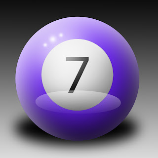
Today we tried to re-create this image of a ball in photoshop using all stuff we have learnt over the last 5 weeks, I made my ball by making a selection with the elliptical marquee tool while holding down shift to make an exact circle. I then  filled it with colour and added an inner glow layer option, I then decided this didn't work and instead I reselected the circle by clicking on the thumbnail of the layer while holding crtl and filled it with white. I then rubbed out the middle with a big soft rubber, leaving slightly more white at the top of the ball. I then did the same thing with black but only left a bit at the bottom. Then on a new layer I made an oval with the pen tool and filled it with a gradient, white to transparent. After that I added 4 highlights on the top left of the ball with a large soft brush at low opacity. For the shadow I simple filled a oval with black and blurred it. Finally I added the white circle and burned the bottom right corner a bit before add in a 7.
In Marz's way we started the same but for the shadow we used the same selection we used for the ball and filled it with black before blurring it and fiddling around with the perspective. We then used the burn and dodge tools for the big highlight and shadows and for the white edge we used a layer mask instead of just rubbing it out. The rest was pretty much the same as how I did it. Although the shadow looks far better. 

This has taught me how to use different methods to get to the same result and taught me a few different techniques.

Friday, 5 November 2010

Proposel

I want to re-design the website "Pandorable' a website for an online shop that is 'your one stop shop for Pandora style jewellery, Pandora style beads, bracelets, necklaces, costume jewellery, bags and more!'. I want to redesign this website because I buy from there and since they are a fairly new business they don’t have much on their website yet, leaving me with a lot of freedom. Another reason I want to re-design the Pandorable website is because I personally know the owner and there is a high chance they will use my website design, which could get my name out and about on the internet.
At the moment Pandorable does not have official logo, but they do have a colour scheme of dusty pink and peach. They sell jewellery and accessories and their style is mostly sophisticated, modern and unique. Fortunately all their stock are all similar items and this help with the overall image of the website. At the moment the website design colours are very soft and feminine and the symbols used are mostly stylized flowers and swirls which reflect the style of the business well. I would like to re-design the whole website but keep the colour themes and maybe the type of symbols used the same. I would also like to make an animated logo that would represent the business well, maybe incorporating a stylised image of one of there products. I would also like to have an animated introduction to the site that takes you to the homepage when you click enter; this will be all animated in flash.
While researching the Pandorable website I noticed that the bulk of the website is made up of images of the products, therefore I will use various methods of capture like video and audio but mostly photography will be used. The photography will be used mainly for images of the products and the video will be used in the same way. The audio will be used for an animated logo or border at the top, as well as the introduction page, I think these features will make the website more interesting.
In my research of the Pandorable website I noticed a few problems with the website that I will fix. For example the preview images for the products are very small and the gallery isn’t very easy to navigate. Another thing I have noticed is that it has a lot of links on the homepage with a lot of content in each, which is quite confusing, I am thinking of instead having links to different groups of products for example; Pandora style bracelets, Accessories, Other Jewellery ect. and then having sub-categories come up when you hover over the link. This should make the website easier to navigate. Another thing I’ve noticed is that with the colours used sometimes the text becomes hard to read as well as some of the symbols used. This is easily changed and I am also thinking of adding a tiny bit of contrast with the colours to make certain things stand out more.

Wednesday, 3 November 2010

Logo's

Logo's are used all around the word as a way of easily identifying a brand or thing. They have been around for many years, starting in the near east with cylinder seal at around 2300 BCE and developing in the industrial revolution into more typography based logo's as different fonts were made. The modern logo came into existence around the 1950's the Chase logo in 1960 was “the first truly abstract logo”.The success of this simple yet identifiable logo changed the whole idea of logo's and gives you what we have today. Logo's are seen as the hardest thing to design as they need to be simple and identifiable at a very small and very large size, they also need to identifiable in colour as well as black and white like the apple logo. Text can also be used in logo's and is advisable in more less-known companies. Examples of good log's are the Apple and McDonald's logo's as even without text they are identifiable and they can either be in colour or black and white and still work in large and small scale. An example of a bad logo is the 2012 Olympics logo as it unreadable even in colour and in small it just looks like a jumble of random shapes.


Tuesday, 2 November 2010

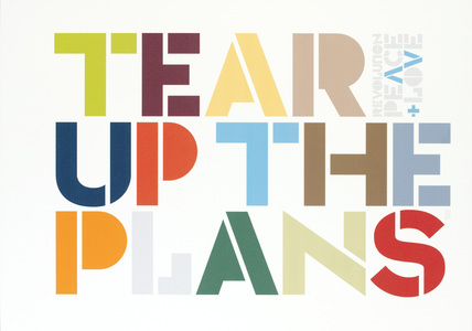
Movie poster.

I chose to do a movie poster about a series of games called Kingdom Hearts. As you can see I used their logo as the main focus of the image and I managed to find and download a font that is based around the font used in the logo. At first I was going to use all the different versions of the logo but it crowded the poster too much and it looked confusing. I decided to use the first logo and then played around with the layer options to make it look as much like the original as I could. I then merged the text layer with a blank layer so that I could add another stroke layer effect in black.

The two characters are from the ending of the second game which are in high quality CG. I used the pen tool as well as the refine edge option on the tips of the hair. For the boy on the right I had to use two different images, the original game footage and a fan image of the same scene. I added the original on top and used a layer mask.
I really like this poster especially the way the text 'The Movie' looks the same as the writing on the logo. If I did it again though I'd probably try and bring out the blue of the eyes more and lower the saturation of the logo as the blue of that overpowers the blue of the eyes.

The pen tool, Refine Edge and Content Aware Fill.

Today we went over the basics of the pen tool in photoshop. We learnt how to make curved lines (click and drag) and stright points (just click) we also leart that you could use the pen tool to make selections, fill area's or stroke the lines you create with the pen tool. We used this to select around these shapes.

We also learnt about refine edge, a tool that basically refines the edge of your selection, it makes selecting hair far easier. And finally content aware fill fills your selection with what it thinks it looks like with the subject of your selection removed. We used this on the mane of this horse.
I already use the pen tool but after seeing the success of this experiment I will use the other tools as well, I would like to try it on a more complex picture though, just to experiment.

Shatter effect in Photoshop

First we typed our word with the text tool and added various layer properties to get a nice effect. We then merged the text layer with a empty layer to  used the polygon lasso tool to make a triangle shape selection and move the selected part of text a bit. After we repeated this a couple of times we got this.

Next we made a selection and feathered it by 50 px. We then went into filter > render > clouds to make clouds fill the selection. We then dis-selected and went into filter > blur > radial blur,  set it too 100 and zoom and got this effect. We then right clicked on the thumbnail image of the text layer and selected 'select pixels' so slect where the words are. we then filled the selecting with 50% grey on a new layer, we then used the same radial blur on it to get this.
Next we added a hue/saturation adjustment layer  after merging the clouds layer and second text layer. Finally we added some smaller text to and added a stroke layer option on the bug and small text layers.
I really like this experiment and I will probably will use it again. If I did though, I'd try to set the radial zoom to a higher setting to make the explosion in the background bigger.

Wednesday, 20 October 2010

Experimentation With shop windows

For this I just moved a few images around under the shop layer. I also used the rectangle selection tool and filled it with white, rotated it, and reduced the opacity to try and make it look like glass. I also added a drop shadow on the shop layer.

I really like the shine on the windows and the silver of the 3D experiment but if I did it again I would try and make them look more realistic.

T-shirt design 4 - Astor Park

For this shirt I used my favourite photo from Astor field for the main part of the shirt, my second favourite for the inside and the Astor park stencil. I used the displace option again for all the images and changed the wite of the stencil to red. 
I really liked the main image I used but I don't really like the text, it's hard to read and doesn't really fit. i would also change the back on the image to a dark grey so shadows could be seen more.
Tuesday, 19 October 2010

Working with 3D max

Today we experimented with a new program, 3D max. We leant how to make shapes like boxes, spheres, cones and teapots as well as how to move, rotate and expand them. We also learnt how to add text and play around with the extrude effect. We then saves our text as PNG's to preserve transparency and played around with them in photoshop.
We then started experimenting with adding seg's on boxes, converting them to editable poly and extruding the faces to make crazy shapes. We then used the Turbo-smooth effect and saved it as a PNG.

We experimented a bit more with this and then we put the renders of the images in photoshop to play around with.
After that we learnt how to add textures by going into rendering > material editor > compact material editor and choosing an image instead of a colour for the diffuse option. We then made a word and used a different texture for each letter. After that we learnt how to add a light source. 
I really liked working in 3D max and I really like the result of my experimenting, I would really like to learn more about the program which would have gotten me better results.