Tuesday, 14 December 2010

Making a website

For my website design  I came up with this idea in photshop which was developed from my design for the iPhone. I decided to add a scrolling panel across the top under the logo witch will take to whatever product you clicked on. The glow effect was made by duplicating the layers, adjusting the brightness and blurring them. I also intended the links to be on the left hand side.

After looking at a load of good and bad websites I realised that links are almost always found on the left of a website so I decided that this wasn't such a good idea. I then tried to make the website in flash but I couldn't get all the effects I wanted so I went into the photoshop file and played around with the layout so its more central so I could import it into flash.
In flash I added four buttons below the logo and set up for different pages. I quite like the layout I used and the scroll works nicely.

Wednesday, 8 December 2010

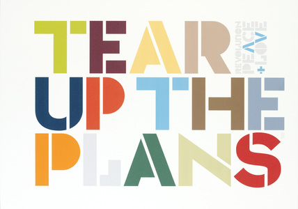
Neville Brody

Neville Brody is a graphic designer, typographer and art director, he's worked for different magazines and made cd covers. His work mostly focus's around typography and pushed the boundary's of art at the time, therefore he was looked down upon by his tutors. His work became more popular and accepted around the 80's and he's been popular ever since.

Personally I'm not very impressed with his work as although when he started it what he was doing was fresh and new now it's everywhere and although it can be creative and limit breaking its still just pictures and words, which I don't find very interesting to look at although I appreciate his hard work.

I don't think I'll use any of Brody's idea's in my website as it doesn't really fit with the image of the website.


Info from:

Tuesday, 7 December 2010

Making a website in flash

Today we made a simple website in flash using pre-made buttons. First we made four layers; background, content, buttons and actions, we then added a new keyframe every 10 frames up to frame 30, we then went to frame 40 and added a new frame. We then got rid of all the keyframe's on the button layer and made a new frame on layer 40 so that things on the button layer will stay on the stage the whole time. We then made a coloured rectangle on the background layer and changed the colour for each page. We then made each button link up to a page buy using the command go to and stop. We also put a stop on the first frame. We learnt how to make a scroll bar by changing the text option to dynamic text typing what we wanted and going into components and dragging the scroll bar to the text box.
This was considerably easier than dreamweaver and I will use flash to make my website. I will also be using a scroll bar.

Wednesday, 1 December 2010

More flash experimentation

Today we made the image of a seagull flying in flash. First we made one of the assets into a movie clip and went into it to add the rest of the assets (left wing down/up, right wing down/up and the body) on a layer each and had the wings up for 4 frames and down for another 4. We then went out of the movie clip and positioned the seagull at the left of the screen, we then moved it to the right side on a new keyframe on frame forty. We then tweened them and repeated the process but flipped the seagull around.
I enjoyed doing this as I am interested in animation anyway so this was an useful exercise. If i could do it again though I'd add more frames so that it moves more smoothly. 

Animating my logo

Today we tried to make an animation in photoshop of our logo. I decided at first to have the crown fade in and then have PANDORABLE revealed by tweening a black block from over the text to the left of the text, this looked horrible though so I blurred the block. Unfortunately this still looked rubbish so I started to fade in every letter one by one, at first I had 5 frames added for the tween but this made it too slow so I changed it to 1.

I then decided I wanted the crown to change colours so I duplicated the crown layer and changed it to a dark pink, then for each frame I raised the opacity on each frame. 

I then added a fade out of the word and the colour of the crown.