I really like the shine on the windows and the silver of the 3D experiment but if I did it again I would try and make them look more realistic.
Wednesday, 20 October 2010
Experimentation With shop windows
For this I just moved a few images around under the shop layer. I also used the rectangle selection tool and filled it with white, rotated it, and reduced the opacity to try and make it look like glass. I also added a drop shadow on the shop layer.
T-shirt design 4 - Astor Park
For this shirt I used my favourite photo from Astor field for the main part of the shirt, my second favourite for the inside and the Astor park stencil. I used the displace option again for all the images and changed the wite of the stencil to red.
I really liked the main image I used but I don't really like the text, it's hard to read and doesn't really fit. i would also change the back on the image to a dark grey so shadows could be seen more.
Tuesday, 19 October 2010
Working with 3D max
Today we experimented with a new program, 3D max. We leant how to make shapes like boxes, spheres, cones and teapots as well as how to move, rotate and expand them. We also learnt how to add text and play around with the extrude effect. We then saves our text as PNG's to preserve transparency and played around with them in photoshop.
We then started experimenting with adding seg's on boxes, converting them to editable poly and extruding the faces to make crazy shapes. We then used the Turbo-smooth effect and saved it as a PNG.
We experimented a bit more with this and then we put the renders of the images in photoshop to play around with.
After that we learnt how to add textures by going into rendering > material editor > compact material editor and choosing an image instead of a colour for the diffuse option. We then made a word and used a different texture for each letter. After that we learnt how to add a light source.
I really liked working in 3D max and I really like the result of my experimenting, I would really like to learn more about the program which would have gotten me better results.
Monday, 18 October 2010
T-shirt design 3 - Graffiti
For this I used my poster on graffiti and played around with the contrast and layers until I was happy. I then copied the layers for the top image and put them in a group. I then copied the group two more times and set the groups to low opacity, I then placed them beneath the capture graffiti to get that effect. Finally I copied the layer with the word love on it and added a motion blur.
I like this design the most but if I did it again I would change the base colour as it's a bit dull and doesn't fir in with any of the other colours really.
T-shirt design 2 - Identity
For this design I used my ID image and made it bigger than the t-shirt and after playing around with the levels I created a clipping mask onto the shirt. I then duplicated the layer twice and moved it around a bit and used the opposite of the layer mask that came with the file for the inside of the shirt. I then added the white area to the layer mask. After all that I added a dark red/pink into the mask layer and set it to overlay. I then used the mask from the inside parts of the shirt to make a similar, darker layer. I then turned all the layers except the shadows layer off and saved it as a .psd file. I then turned all the layers back on and with the ID layer selected I went into filter > distort > displace and chose the file I just saved.
I really like my t-shirt design especially the colour of the scan of my hand. If I could do it again I would make the black more of a dark grey and add more shadows and highlights as it looks really flat.
T-shirt design 1 - Typography
My first t-shirt is based around a piece of typography I did earlier by typing into a speech bubble shape in photoshop. I then went into edit > transform > warp and made it balloon out in the middle. I then inversed the text layer and put in overlay so that all the colours except the white showed. I then duplicated the text layer 3 times and lowered the opacity, I then used a big soft rubber to rub away more and more of the bottom on each text layer.
I really like my final design, especially the colours used. Although if I could do it again I would try and make the balloon effect of the text fit in more with the t-shirt as it doesn't look like it belongs there.
Experimenting with Marantz
Today we experimented with a recorder called a Marantz, it lets you record either mono or stereo sound into many different sound formats. First we had to plug it into the mains then we attached an external microphone called a gun mike. The gun mike is a microphone encased in foam which only record the sound in the direction you point it in. The other mike is a normal mike where it picks up sound from all directions. We also learnt how to format it and how to change the levels so its not too loud or too quiet.
Wednesday, 13 October 2010
Identity Poster
Today we made a quick black and white poster in photoshop using scanned images, text and drawings as well as out name and date of birth. I went into edit > transform > Warp to wrap my date of birth around the scan of my arm I also used perspective to change the two 'Jodie's in the background. The back of the image is just my name repeated again and again. I enjoyed making this poster and I really like the final effect but if I was to do it again I would try and make it a bit less complex as it's a bit too crowded.
Tuesday, 12 October 2010
Graffiti Art
Today we did a load of research on Graffiti art and styles.
Graffiti has its roots in cave paintings nearly 32,000 years ago, over time it developed and in Greece the first modern graffiti started. In the 60's urban graffiti was born and in the 70's the style wars started, it was seen as the 'golden age of graffiti' but then security was increased and it started to die out.
Graffiti artists were influenced to do graffiti on streets and walls because in society it is seen that people like them didn’t have talent and because they came from ghettos and other poor places, which many said were devoid of culture.
Their influences are normally their own life or what is happening on the media. They could also be influenced by other street artists like Banksy, who was influenced by other artists and musicians like Blek le Rat.
There are many forms of graffiti used around the world. Graffiti artists have to choose carefully between detailed pieces that take lots of time (“wildstyle”), or quick peaces called “throw up’s” or “bombing”. The longer a peace takes the higher the chance of getting caught.
Graffiti are it very controversial and while some see it as art, other see it as vandalism. Graffiti has made a huge impact on the world of art, probably because of the way there are no rules for it and its always in the public eye. There’s also a sense of freedom about their work as they can draw what they like.
We also experimented with making our own graffiti on paper using pencils and pens.
I was proud with my final graffiti piece and I thought it looked good and detailed. But I don't really like the graffiti style and although it was fun to do I don't think I will use it again, if I did I would probably draw it bigger as it was hard doing the blue outline.
Monday, 11 October 2010
Street-Art documentary
Today we watched a documentary about street art. It was all filmed by one guy, Thierry Guetta, one of Banksy's biggest fan's. At first Thierry sold cheap clothing for high prices claiming it was 'designer' and filming only was a hobby. On one trip to France Thierry started filming his cousin 'Invader' when he was putting his space invader mosaics all over France. This sparked Thierry's interest in street art and soon he was filming practically all the popular street artists except Banksy. When he finally did get a chance he started making more and more footage until he finally made a film. Unfourtunatly the film was horrible and Banksy said the nicest thing he could to Thierry and suggested he try street art. Soon Thierry put on a massive show using all the tricks of the trade he learnt from the years of filming. He then became the man in front of the camera instead of behind it and made tonnes of money as Mr. Brainwash because of hype mostly.
Experimenting with typography
Today we experimented with typography. First we chose a feeling and then we tried to envision it only using letter stamps, black ink and red ink.
After we experimented with that we went on the computer and experimented with the different effects like fish eye, wave, ark and fish that you can give text with the 'warp text' effect
After that we learnt to make the text follow a path we drew with the pen tool.
And how to fill a closed path with text.
We then moved on to more detailed selections made from photographs which gives the image a very interesting effect.
We then moved on to more detailed selections made from photographs which gives the image a very interesting effect.
I really like the different effects I got form typography, especially in the second image with the shapes I made, I will probably use typography again some day. If I could do this again I would use more fonts though.
Wednesday, 6 October 2010
David Carson
Today we looked at the typographer David Carson. He is an American graphic designer who is best known for his magazine (ray gun) designs and use of experimental typography. David was one of the most influential graphic designers of the 90's with his grunge style.
He used to be a teacher but then he started to experiment with graphic design and by the end of the 80's developed his signature style and soon got named the 'father of grunge'. He now lectures throughout America.
I like his work because its very unique and stands out a lot with the use of bold colours, I also really like his grunge style. The only thing I don't really like is the abstractness, but that's just because I don't really like abstract in general.
Capturing Astor field
Yesterday we went to Astor field and 'captured' it using three different methods we decided on earlier. I chose to take pictures, draw and collect thing's. When we got back I scanned in the things I collected and drew and put the pictures on the computer. I decided the main image's I wanted were the dog, eye and a mixture of different places on the wall. I used free transform to shrink all the pictures of the graffiti wall and line them up, I then used a big soft rubber to rub out the grass and the fence above. I then started rubbing away parts of lots of other images used using a small hard rubber because I was only going around the outlines of lines in the pictures. I then decided there was too many things going on and got rid of lots of the pictures. After I was happy with all the positioning I started to play around with the scans of my drawings and collected items. In the end I only used the bottle cap, the leaf (duplicated) and the wire. From my drawings I chose a stencil of Astor park (on one of the post the metal was cut away in stencil style saying 'Astor park') and changed it to white and added a drop shadow in layer effects. I then decided the wall part looked weird with soft edges when the rest was all clean cut, therefore I added two white boarders instead. Finally I added a layer under the 'astor park' layer and filled it with black and set the layer to 'soft light'
Tuesday, 5 October 2010
The history of drawing
The first drawings originated around 32,000 years ago from early cavemen. They would draw simple images (usually of animals) on the walls of caves, these images were very basic and made up of mostly shapes and there wasn't much use of colour either. Most of the images were made by engraving into the rock but some were painted on with clay. Later they started to paint on the walls, they only had access to the colours black red brown and yellow though. No-one knows why the cavemen started drawing, weather it was to leave messages or for religious purposes.
As time moved on drawings got more and more elaborate until the first written language was created in Egyptian times. It was basically just a load of symbols with meanings but it became the foundation for all written languages and had more 700 symbols. By Egyptian times the images were far more detailed and more colours were used, art was everywhere and most of it was religiously orientated, for example paintings were used to give people a pleasant afterlife and wall carvings and such were found all over temples.
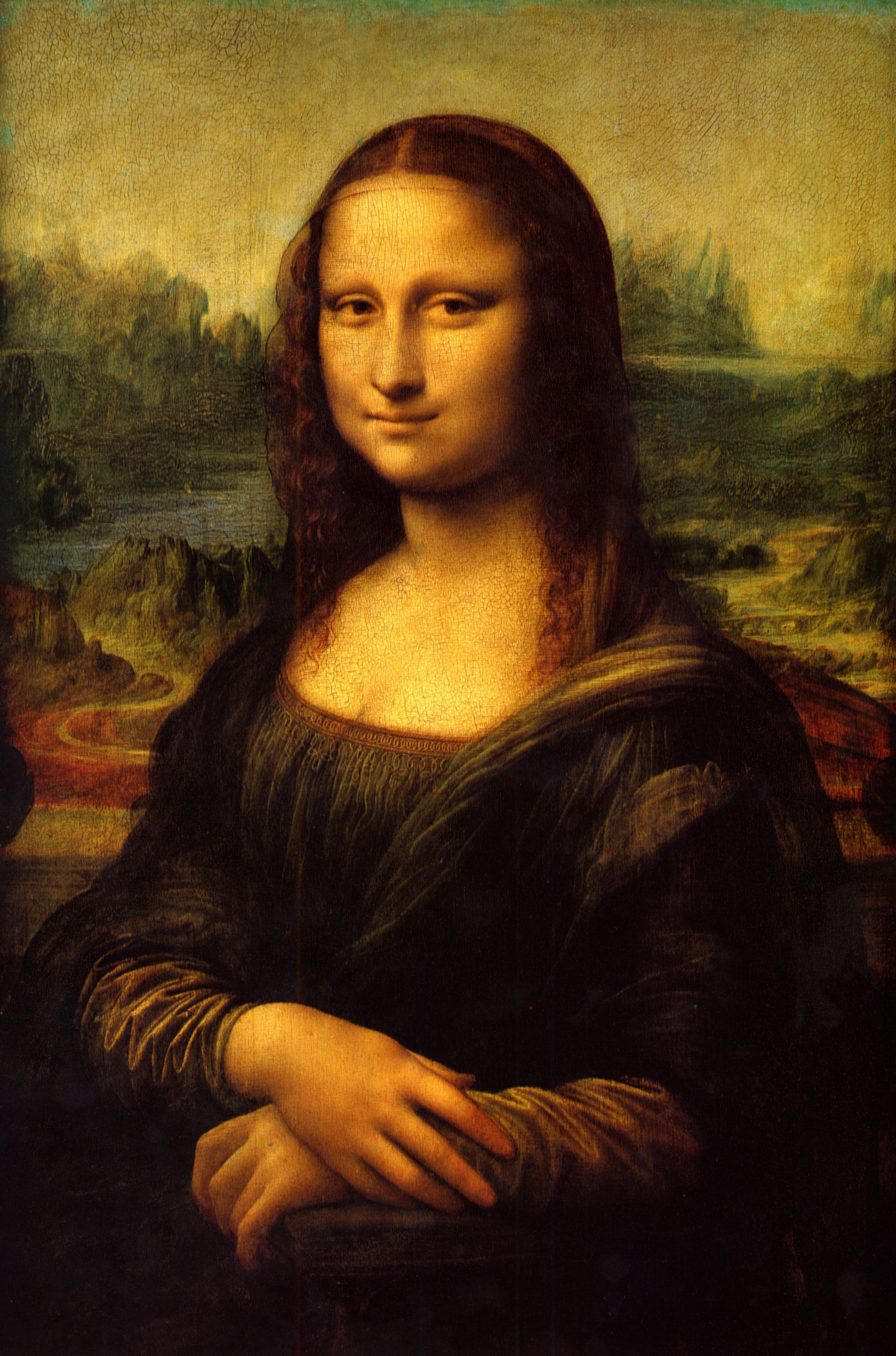
In the 1400/1500's the Renaissance kicked off and drawing became more realistic as scholars looked for more emotion and realism in artwork. Lots of portraits of people were made in those years and there was now a wide variety of oil based paints, pencils, chalk and other drawing equipment.
At around the late 1800's more abstract work started to appear and while it was shunned at the time it soon became popular and is now the foundation of most modern art. Although before art was of a very high level abstract art inspired originality and challenged artists more as instead of just coping what they saw before them, they had to imagine.
Info from:
http://en.wikipedia.org/wiki/Cave_painting
http://www.artchive.com/artchive/C/cave.html
http://en.wikipedia.org/wiki/Art_of_ancient_Egypt
http://en.wikipedia.org/wiki/Renaissance
http://en.wikipedia.org/wiki/Computer_art
http://en.wikipedia.org/wiki/History_of_anime
http://en.wikipedia.org/wiki/Anime
As time moved on drawings got more and more elaborate until the first written language was created in Egyptian times. It was basically just a load of symbols with meanings but it became the foundation for all written languages and had more 700 symbols. By Egyptian times the images were far more detailed and more colours were used, art was everywhere and most of it was religiously orientated, for example paintings were used to give people a pleasant afterlife and wall carvings and such were found all over temples.
In the 1400/1500's the Renaissance kicked off and drawing became more realistic as scholars looked for more emotion and realism in artwork. Lots of portraits of people were made in those years and there was now a wide variety of oil based paints, pencils, chalk and other drawing equipment.
At around the late 1800's more abstract work started to appear and while it was shunned at the time it soon became popular and is now the foundation of most modern art. Although before art was of a very high level abstract art inspired originality and challenged artists more as instead of just coping what they saw before them, they had to imagine.
Digital Art:
In the mid 1960's engineers and scientists started experimenting with computer programs to make art and in 1062 A. Michael Noll programmed a digital computer to generate visual patters just for artistic purposes. Soon drawing machines were made and digital art started to get it's own exhibitions and finally in 1987 adobe illustrator was made followed by adobe photoshop in 1990.Anime/Animation
In art through the ages movement was implied in still images and many small contraptions like the magic lantern and the flip book were made to make the illusion of movement. When film was invented stop frame animation was discovered by accident. In the early 1900's frame by frame animation of cartoons were invented and called cell animations, over time they developed and in the late 1910's Japan started to make short animations. over time they developed a distinct style that has many different sub genre's and even more differer styles.
Info from:
http://en.wikipedia.org/wiki/Cave_painting
http://www.artchive.com/artchive/C/cave.html
http://en.wikipedia.org/wiki/Art_of_ancient_Egypt
http://en.wikipedia.org/wiki/Renaissance
http://en.wikipedia.org/wiki/Computer_art
http://en.wikipedia.org/wiki/History_of_anime
http://en.wikipedia.org/wiki/Anime
Capture mind map
Today we investigated different ways of capturing. We used a computer program to make this mind map and we moved about the class adding to other peoples to develop it more. I have decided to focus on the capture methods Video, Drawing and Object collection. I will use these to capture Astor Field.
Subscribe to:
Comments (Atom)


